
Flight booking product for an airline.
Right click on the images to open the full view.


The airline industry has the largest cart abandonment rate of any online industry at 88.78% (per Zippia).
Find the largest reason for the high abandonment rate to create a product that will address the concern and reach a lower rate.
Identifying the reasons for the high cart abandonment rate.
Finding the most common product pattern for flight booking.
Identifying the user pain points in the above pattern and how they can be improved upon.

The first step in the research is to find out which platforms (desktop, mobile web, and mobile app) are popular and what their individual abandonment rates are. According to organizations such as Zippia and ResearchGate, around 67% of flight bookings are made online. Of the platforms, mobile sites have the highest abandonment rate (85%) while mobile apps and desktop sites have the same rate at 67%.
Using these data points as a start, a survey was conducted to find out the platform that is the most common, reasons for abandoning a cart with a booked flight, and what could make the experience smoother for a user to book their flight successfully.
The survey questions were chosen to ensure that the surveyors were able to complete it conveniently and still have data that was relevant to the task at hand. Consultations by an anthropologist were carried out to aid in this process.

The majority (73%) of survey respondents primarily use a laptop or desktop site to book their flight(s), but many were open to downloading a mobile app to book as well.
The largest reason for cart abandonment has been due to pricing, in particular hidden fees not displayed in the original ticket price and competitor prices.
The 2nd largest reason was because of an unoptimized site or app that was too slow in loading, causing them to become frustrated.

Users want to have the biggest deals and transparency with their flight prices since it is a large luxury expense.
Desktop sites are an optimization priority since most users book this way, but mobile users cannot be ignored since they make up a significant minority.
Many users are willing to switch to a competitor if they have a bad experience with an airline.
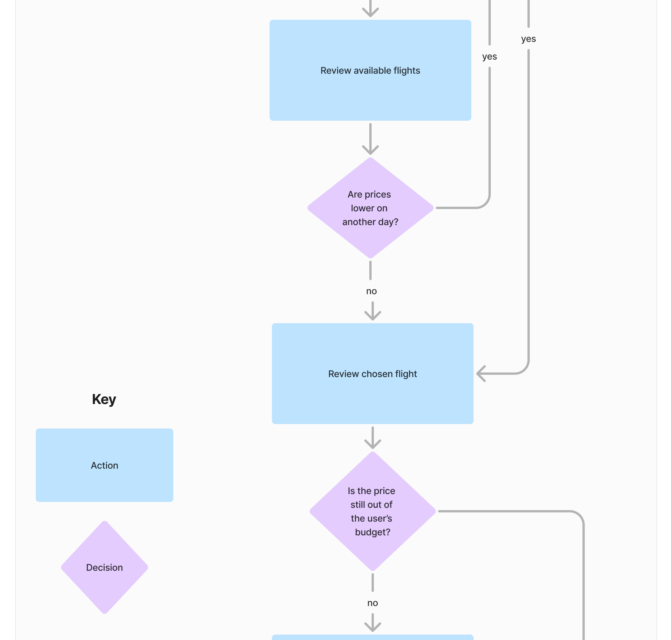
Using the research and key features above, a user flow was created below. This focused solely on the booking experience and showed how a user may navigate the product, including why they may abandon it at certain points.


Even though this project was focused on the booking experience, an entire site structure was created to inform the key features and provide a solid foundation for further work later.


Having the user flow and site structure as a base, the basic wireframes were created. Different products from similar airlines from the moodboard shown below were also used as points of reference while using the user feedback from the research phase to create a more efficient version.
A moodboard was created in order to get a feel for the visual identity of the site, from the hierarchy to the colors and features that may or may not work in the final product. The visual process was done concurrently with the research phase, since looking at similar airline products could give a baseline for what the user expects from the industry as a whole. With the moodboard, the color scheme below was established with the WCAG AA color contrast accessibility guides as a reference.

This project was an interesting challenge in taking specific user feedback on industry practices as a whole and creating a product that would attempt to solve the issues to increase interactivity. Being able to engage in both aspects of UX Research and Design was eye-opening to the full process of gathering the data and seeing how UX intersects with other fields such as Anthropology.
In the future, gathering data on the rest of the site’s structure, such as how rewards programs interlink with checkout and how it affects the abandonment rate would be an interesting exercise.