
Portfolio showcasing UX and Product work.
Right click on the images to open the full view.
Previous portfolios I have created haven’t shown my UX and Product Design processes in full, and feedback from recruiters has shown that a full redesign should be done.
Creating a portfolio site using all of my knowledge of the research and design processes, including developing the site myself to show how development informs design and vice-versa.
There is professional work that is unable to be shown due to Non-Disclosure Agreements (NDAs) signed.
Using feedback from recruiters while also being unable to contact any for testing due to conflicting schedules.
Adhering to
WCAG web accessibility, with the overall aim being to fully be in the AA guidelines while hitting most AAA benchmarks.
Most of the research done in this process has been going through other UX designers’ portfolios and seeing how their case studies have been formatted, as these involve disseminating large amounts of information in a clear, well-designed manner. A lot of the resources used were through sites such as Cosmos, Best Folios, etc. for layout inspiration.
The homepage portion of the site was improved using feedback from various recruiters who provided valuable insight into the priorities of someone who is navigating it. The most common critique was the space between the hero and work sections having superfluous information not needed by someone skimming the page, and as a result, that filler section was cut, as you can see in the design section below.
The overall structure of the site is very simple in order to make navigation easy for visitors. There are only two basic page designs, the homepage and the case study page template. Each of the case studies uses this template with variations on the information and sub-sections in them.
The homepage is structured into sections—work, experience, about, and the footer/end. These were chosen specifically because they are the most relevant information in order of importance, as gathered from recruiters talked to. Each of the sections is able to be accessed easily by the navigation bar as a quick option.
The two main pages from the site structure were wireframed based on the research and feedback provided. First, the wireframes were sketched on paper in order to iterate through different feels of navigating the site, then one was chosen to be done in Figma. With the Figma designs, a 12-column grid with baseline rows was used in order to make the transition to code easier. With the grid established in the design phase, there would be no guesswork on the placement of elements.
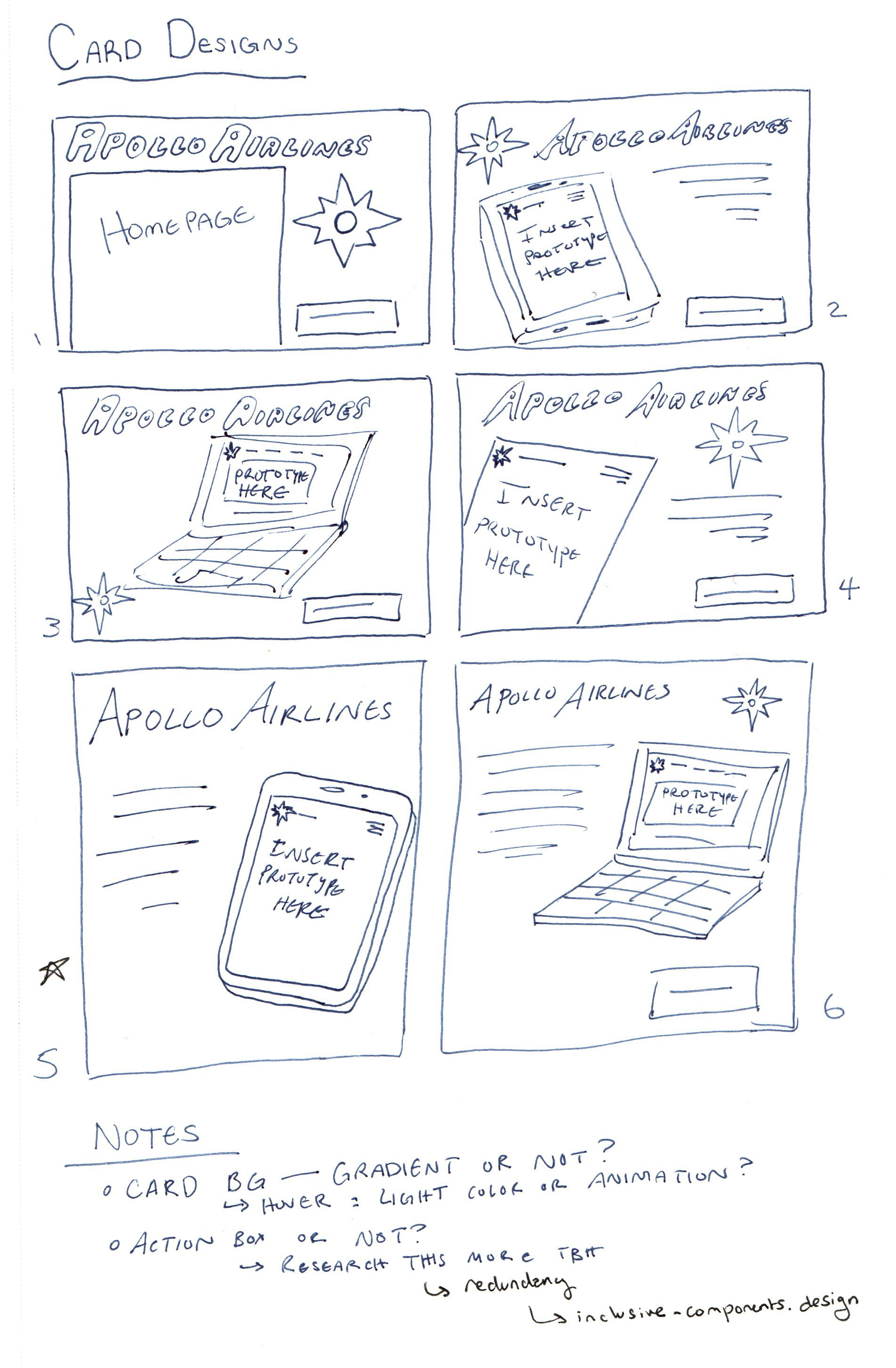
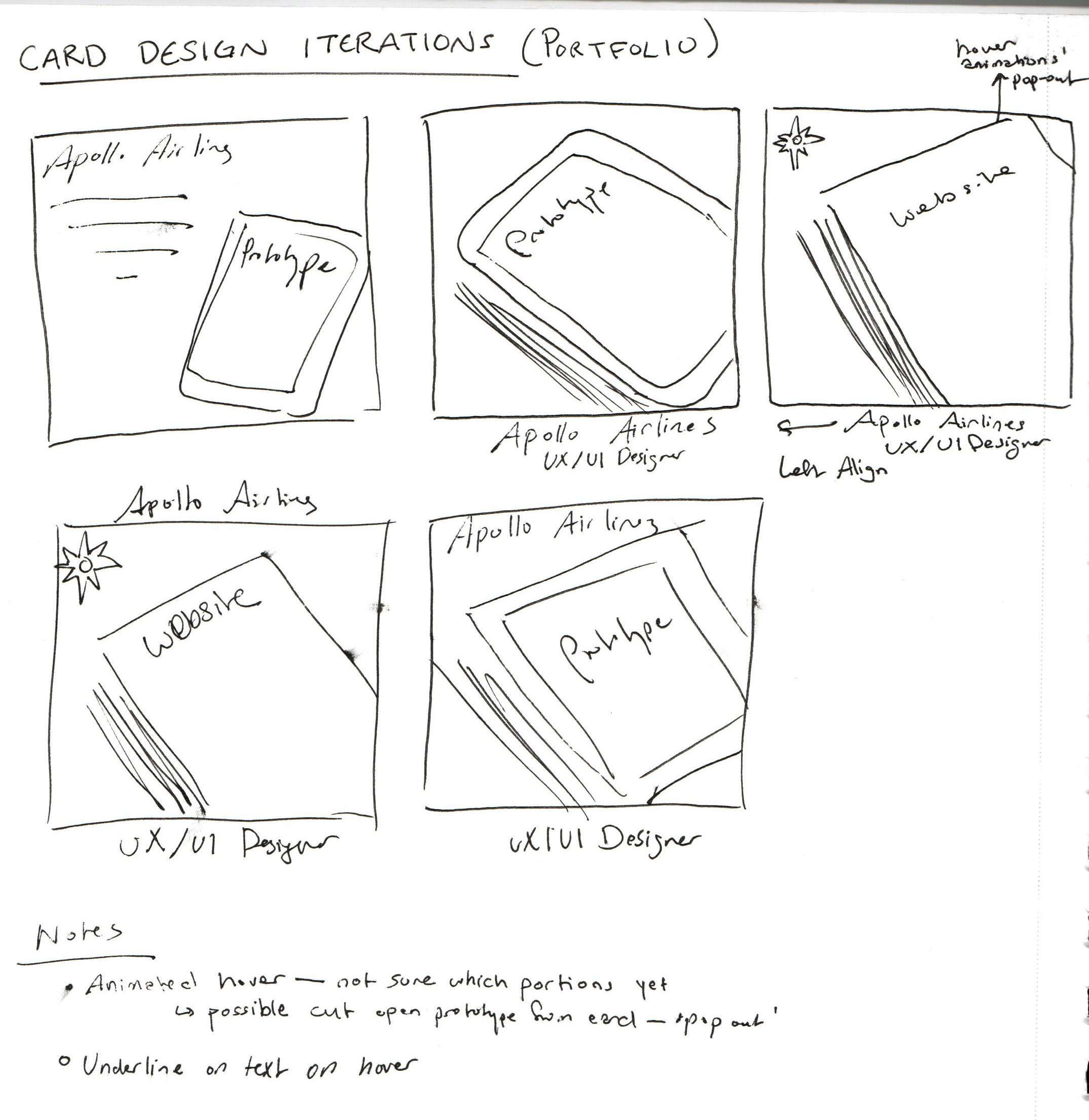
The visual identity for the portfolio is based off of my brand identity that was already established. The logo reflected my Armenian culture as it was my name in the Armenian alphabet; I decided to go with a space theme for my identity due to the significance of astronomy in both my culture and my own life. That led to deciding the color scheme below, and the main graphics in the site itself.
I learned a lot from working on this project, incorporating user feedback to being mindful of my own designs to aid in the transition to code. By developing the site myself, I was able to understand how design and development go hand in hand, and how I might format my own content and wireframes to be easier for the developer to use as a basis during the handoff.
It also taught me a lot more about computer networks and how to host a site solo, which I think is valuable information for both UX designers and front-end developers.